New
Before
User Account Page Design Changes
In an effort to enhance security and improve user control, I removed the card details section from the user account page due to security concerns.
Additionally, I replaced the ambiguous 'Settings' section with more straightforward options: 'Enable or Disable Notifications,' 'Enable or Disable Location,' and 'Change Theme and Language.' This streamlined approach simplifies user navigation and provides clear control over key preferences, ensuring a more secure and user-friendly experience.
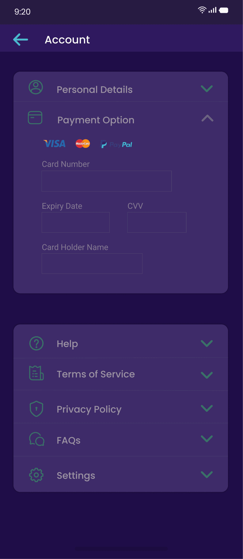
User Account Page
Goal: Improve user control and security through clearer UI and actionable preferences.
Changes Made:
Removed the card detail section from the account page for security reasons.
Replaced ambiguous toggles with clearly labeled preference options:
Enable/disable notifications
Change location
Change password/language
UX Impact:
Simplified navigation
Better user confidence in managing personal settings
Reduced risk of accidental changes or confusion
Project Name: Launder
Role: UX Designer
Team & Tools: Worked independently and primary used Figma
Problem Statement:
Customers look out for trustworthy laundry service providers when they are trying to make out more time for their work or family.
Laundry service providers especially the startups are looking for ways to reach out to new customers and increase their customer base.
A group of customers/users prefer contacting laundry service provider directly instead of going through the process of selecting items on website or app, this group of customers are the reason why laundry service providers are finding ways to make customers commit to using site to book laundry.
Solution:
Launder is a ideal Laundry mobile app that gives option to users to either select items individually or proceed to place order of laundry service.
However, Launder encourages users to use more of app; selecting laundry items and making payment online rewards users with discounts and loyalty packages. Launder also enable users to track their order, progress of laundry and delivery, give feedback and access to hack videos for clothes care.
Launder helps laundry service providers reach out to a broader customer base, they are provided the platform to offer their unique services to users, get feedback and be recommended to more users when they get more positive feedbacks.
Brief Description:
Laundry companion connects users seamlessly with laundry services while making your experience effortless and educational.
A chat with a laundry service provider
Research and discovery
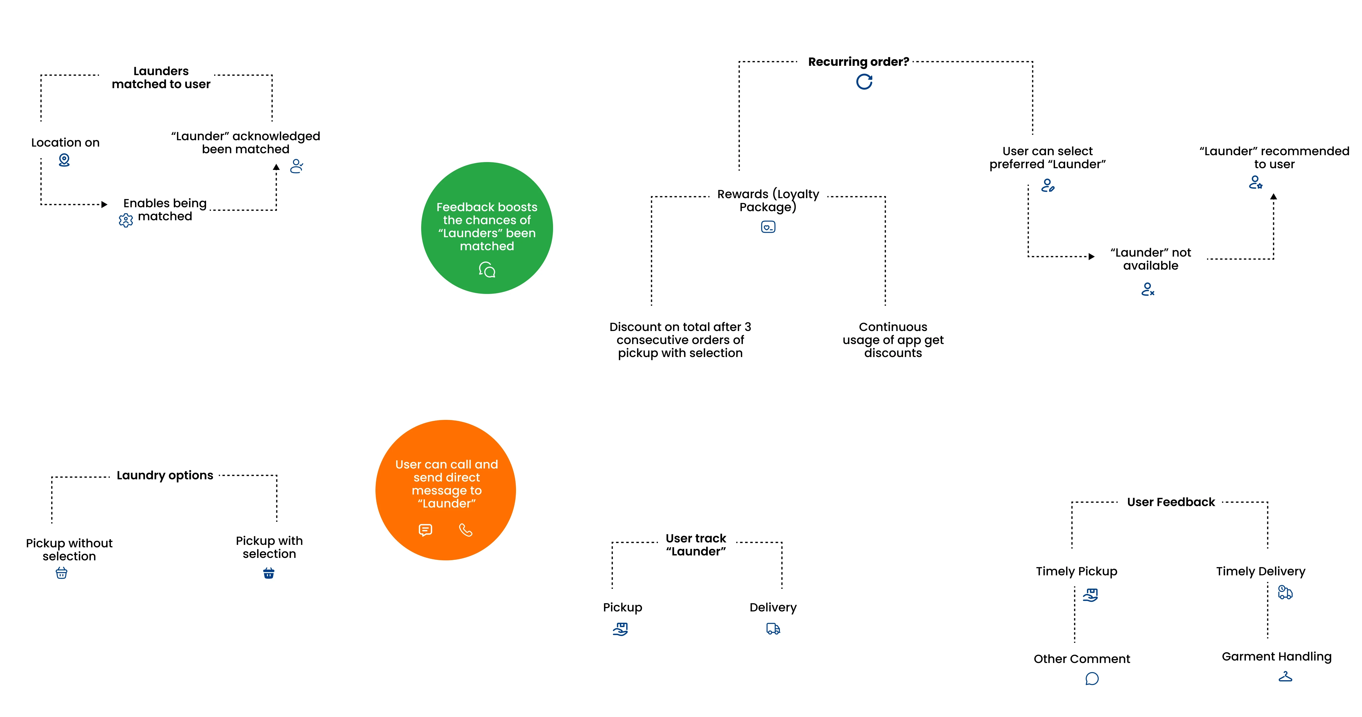
Model for the Laundry App:
The model was created to bridge the gap between user needs and business goals. With my Business Analyst background, I designed this model to enhance user satisfaction and optimize operations.
Key elements include:
Matching Process: Users are paired with launderers based on location and feedback improves future matches.
Laundry Options: Flexible pickup choices and tracking features for transparency.
Communication and Support: Direct messaging and calls to the 'Launder' for improved customer support.
Loyalty and Rewards: Discounts after consistent usage to boost retention.
User Feedback Loop: Gathering insights on timely service and garment handling to improve quality.
I interviewed a laundry service provider and the result of the interview changed the flow and interface of what I initially designed. One of the point I took from the interview is that “customers seeking to use a laundry app get put off when the first screen they see is to create an account” and “his customers prefer making calls directly to him than selecting the type of clothes they want for laundry.” My interview with the Laundry provider led me to re-define a model plan for Launder and gain understanding of the user types, task flow and journey which were given in details in the illustrations provided.
Reflection for improvement
Furthermore, after reviewing the design with a focus on usability and accessibility, I identified areas that could be improved to enhance the overall user experience. By applying insights gained from design articles and courses I’ve taken, I made strategic changes to some screens to improve navigation and accessibility. This process not only enhanced the product but also reflects my continuous growth as a designer and my commitment to creating user-centered solutions.
User Types
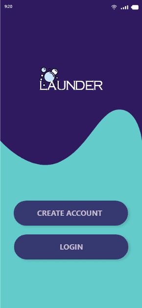
Wireframes and Low-fidelity design

Your next door laundry service!
Enter location manually
Use your current location
LAUNDER
or
9:20
Reason for Design Change: Laundry App Start Page
After interviewing a laundry service provider, I gained valuable insights into user behaviour and preferences. The feedback revealed that users seek convenience and efficiency when using a laundry service app. The initial design, which included a 'Create Account' option on the start page, posed a potential barrier to user engagement, as users preferred to explore the app's functionality before committing to an account creation process.
In response to this feedback, I removed the 'Create Account' option from the start page and replaced it with a simple search bar for location input and a 'Skip' option. This adjustment allows users to quickly find available laundry services in their area without the friction of mandatory account creation, enhancing the overall user experience.
Now
Furthermore, after revisiting the project and reflecting on my learning from design articles and courses focused on user-centred design and accessibility, I recognized the importance of reducing cognitive load and streamlining the user flow. The revised design aligns with best practices in UX design, offering users a more intuitive and seamless experience from the moment they open the app.
These changes address the pain points identified during the interview and reflect my growth as a designer in prioritizing usability and accessibility.
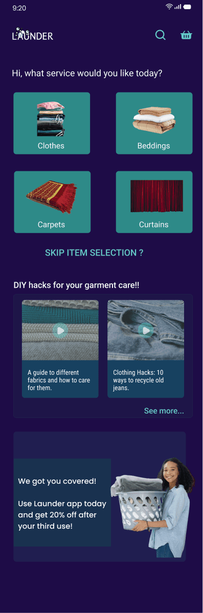
Before
Home Page Design Changes
Upon revisiting the design, I made additional modifications to enhance the app’s functionality and user engagement. I moved the 'Hacks Videos' section to a separate page to maintain focus on the primary purpose of the app – booking laundry services. This change reduces visual clutter and keeps users' attention on the core service options.
I also repositioned the 'Discount Advert' to appear before the service options. This strategic placement aims to nudge users to take advantage of special offers and increase app usage.
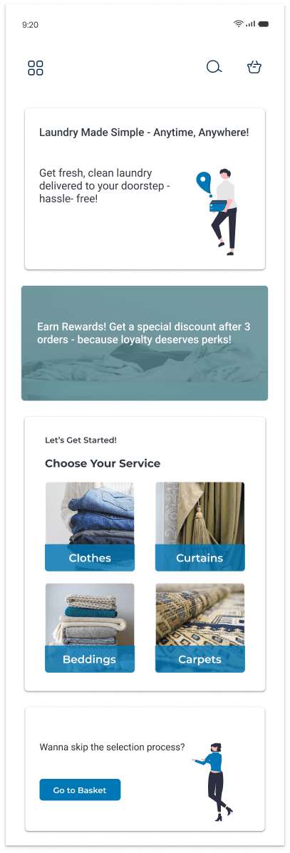
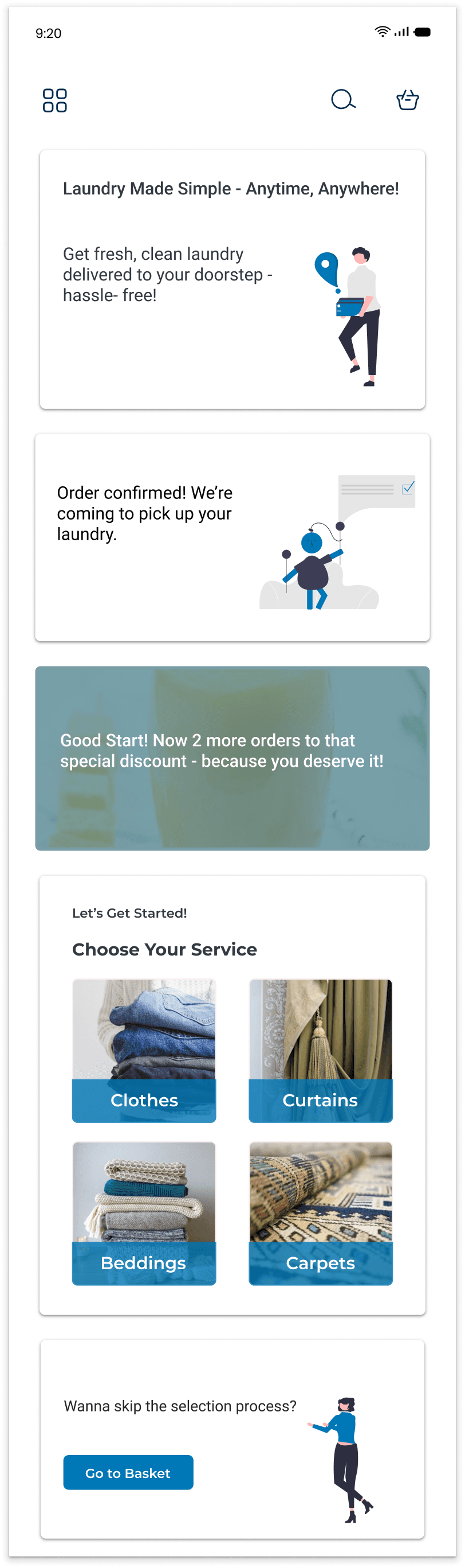
Now
Additionally, I designed an 'Update Card' on the home page that appears after a user has ordered a service. This feature provides users with real-time updates on their order status, improving transparency and enhancing the overall user experience.
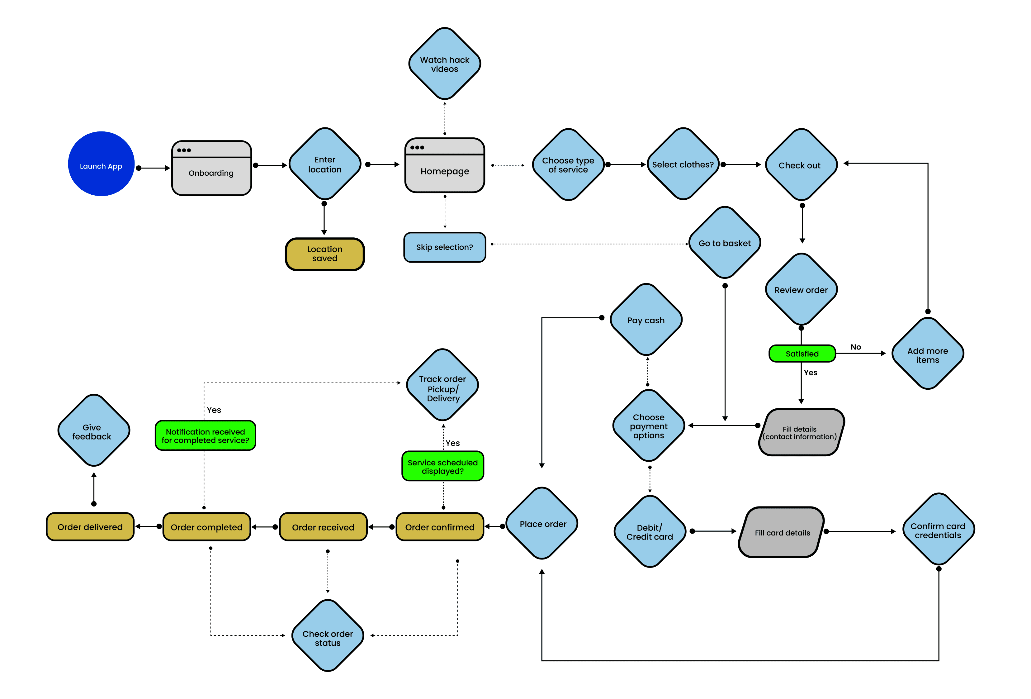
User Journey Map
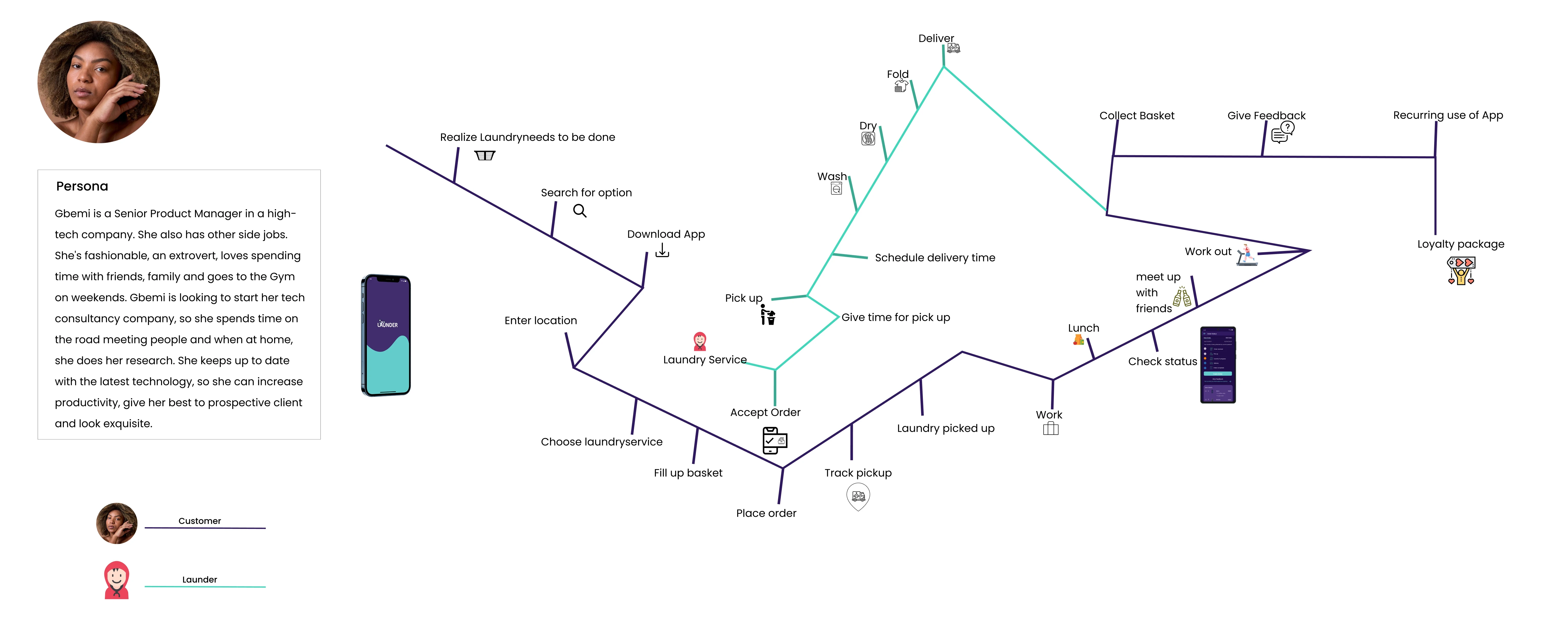
A Customer User Taskflow
Moodboard
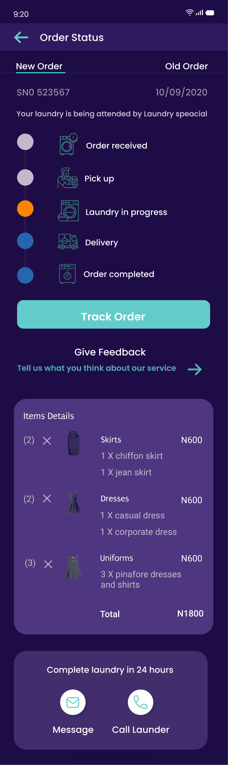
The new “order status” screen is a complete change from the previous, giving users a complete view of their order process and option to view old orders.
New
New
Before
After
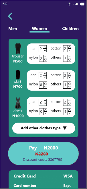
Redesign of the clothes selection screen because the previous reduces the chances of users selecting clothes as it gives them so many options at once which can be overwhelming and tedious.
Before
After
Goal: Simplify the selection process and reduce cognitive load.
Changes Made:
Old version: Users had to choose sizes and quantities for each item in a dense format.
New version: Grid-based layout with preview images and simple quantity selectors.
UX Impact:
More intuitive and visual interface
Streamlined flow minimizes steps
Reduced decision fatigue and errors
Goal: Provide transparency and control over orders.
Changes Made:
Old version: Basic progress indicator, lacking detail.
New version: Detailed step-by-step journey with visual progress indicators and delivery info.
Users can now view old orders and track current ones with more context.
UX Impact:
Improves trust and user satisfaction
Reduces support inquiries by showing live order state
Encourages reordering by showing past history
9:20
LAUNDER
Your next door laundry service!
Skip
Back
Enter location

New
Before
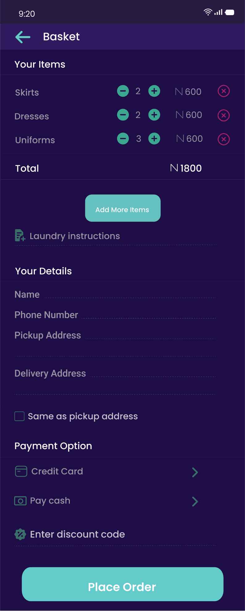
Basket Page Design Changes
After revisiting the design for the basket page, which displays the selected laundry items, I expanded each laundry item to include more detailed information on the selections made. This change allows users to easily modify individual items within a laundry category without mistakenly canceling an entire category. By providing better visibility and control over selected items, users can reduce errors and have a more seamless experience when managing their laundry orders.
Reflective Thoughts
Basket Flow
Problem (Before):
All laundry items grouped per category with limited editability
User had to re-navigate to change specific items
Form layout and payment methods lacked clarity
Solution (After):
Categories now expand to show individual laundry items (e.g., “Skirts” → “Chiffon”, “Jeans”)
Each item shows quantity, cost, and removal icon
Payment section supports card or cash with added input validations
UX Impact:
Greatly improves item-level control
Reduces error rate and enhances order accuracy
Streamlined checkout with visual cues and input guidance
Redesigning the Launder app was a user-centered process aimed at simplifying laundry service ordering through clear interfaces and thoughtful interaction design. Each design decision—from the restructured clothes selection to the enhanced basket and order tracking pages—focused on reducing user friction, increasing transparency, and improving overall satisfaction.
User interviews and usability insights revealed key challenges in the original experience, including overwhelming item selection, vague order statuses, and limited customization. The final prototype addresses these by introducing:
A more visual, streamlined item selection process
Expandable, editable item views in the basket
A detailed, multi-stage order status tracker
Looking Ahead
Although this phase focused on the customer experience, early interviews with a laundry provider revealed operational challenges like unclear orders, lack of item breakdown, and communication delays.
These insights offer a strong foundation for designing the laundry provider’s interface in the future.
Moving forward, I plan to:
Design a provider dashboard for managing and updating orders
Improve communication between customers and providers
Explore analytics tools to support service quality and efficiency
This project reaffirmed the value of designing for the entire service ecosystem and how even simple UI shifts—when research-led—can transform a fragmented journey into a smooth, trustworthy experience.